Sorry to be all tweaky about this, but could you give the actual live dimensions for these, like A4 or A5 with a 1/2" or 1cm margin, or similar. "100%" or "80%" on some browsers or readers is often very random.
And I love image. There's an "Oh shit..." quality to it that makes me think Mandy's (or whoever's) next attack is a head-butt, followed by grappling, since the melee shit seems to have just hit the fan.
You may not like it, and that's your opinion and I won't try to change your mind, but other people do. I like Zak's work. It's different, occasionally challenging, and a refreshing change from the heroic fantasy artwork that's going around these days.
As for the 'community' being sycophantic, I believe it's called encouragement and support. Something we could do more with in this world, whether it is gaming or otherwise. There's enough negativity already, let's be positive for a change.
Initial impression was that it could use a little more contrast, particularly between the subjects and the background, but I'm not so sure thats case. I kind of like the gritty and indistinct style... It will certainly look unique on a shelf I think.
Im visualising the title of the kit in Sexy White up the top of the image there? I presume it will be in the font you posted earlier?
I think the crispness of the text will really help to A: cement the background as the background and B: isolate the lower half of the image and thus make the subject a little more obvious.
If it sounds like I'm making stuff up its because I am struggling to articulate my impressions with my non-visual-artists vocabulary. Cheers!
The coloration makes it difficult to see what's going on. Sometimes too much detail detracts from the scenery. Glad that some people like it but its too busy and too muddy for my personal taste.
I love it. The buildings seem like they could be fossilized buildings from the future. Is that becandled peryton trying to use its one kill in life to bring yet another empire to its knees?
I like the style, BUT I couldn't tell what she was fighting, and then when I saw in the notes it was a peryton, I had to go back and look and try to find its head.
Anyone who doesn't look at a painting I did for longer than 2 seconds clearly has terrible taste and can fuck right off 'cause I'm not WOTC & don't need their money.
The ancient kingdom of Spidernesti
-
"The House of Stars became the House of Spiders".
That's the line from Tanis's secret journal that the heroes managed to
decipher. And the druidess rea...
Goodness Gracious, I've Gone to the Dark Side
-
What with the new 2024 revisions due to start being released this coming
September, I am converting my online game to D&D 5th edition.
I still have to en...
Dungeon Apps
-
"I’ve just been wondering what apps adventurers would use if smartphones
worked in dungeons"
- Jeff Rients
Here's some ideas we had:
"Lock app for th...
Cities of Darkness
-
Unlike D&D, I've got a soft spot for the classic World of Darkness lore. I
am too young to have been around while it was relevant but it's always had
the...
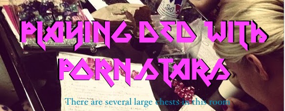
I'm Zak, I live in Los Angeles. Most of the people I know here are women I know from being a porn "actor"--so they're porn stars and strippers. So that's who I play Dungeons & Dragons with.


20 comments:
Sorry to be all tweaky about this, but could you give the actual live dimensions for these, like A4 or A5 with a 1/2" or 1cm margin, or similar. "100%" or "80%" on some browsers or readers is often very random.
Thanks.
And I love image. There's an "Oh shit..." quality to it that makes me think Mandy's (or whoever's) next attack is a head-butt, followed by grappling, since the melee shit seems to have just hit the fan.
Stunning! I can't wait for the release.
I do like the style of your art. Looking forward to getting this when it comes out.
Wow, awesome. I really look foreword to this one!
Amazing. I must say its the upper background that really catches me though. The texture and colors of the abstracted 'ruin' are just incredible.
@radnoff
You may not like it, and that's your opinion and I won't try to change your mind, but other people do. I like Zak's work. It's different, occasionally challenging, and a refreshing change from the heroic fantasy artwork that's going around these days.
As for the 'community' being sycophantic, I believe it's called encouragement and support. Something we could do more with in this world, whether it is gaming or otherwise. There's enough negativity already, let's be positive for a change.
I dig it.
Initial impression was that it could use a little more contrast, particularly between the subjects and the background, but I'm not so sure thats case. I kind of like the gritty and indistinct style... It will certainly look unique on a shelf I think.
Im visualising the title of the kit in Sexy White up the top of the image there? I presume it will be in the font you posted earlier?
I think the crispness of the text will really help to A: cement the background as the background and B: isolate the lower half of the image and thus make the subject a little more obvious.
If it sounds like I'm making stuff up its because I am struggling to articulate my impressions with my non-visual-artists vocabulary. Cheers!
The peryton doesn't quite stand out, it's kinda the same hue as the cloak and the pillars...
great work and thanks for posting the font the other day.
The coloration makes it difficult to see what's going on. Sometimes too much detail detracts from the scenery. Glad that some people like it but its too busy and too muddy for my personal taste.
I love it. The buildings seem like they could be fossilized buildings from the future. Is that becandled peryton trying to use its one kill in life to bring yet another empire to its knees?
I can't wait for this book.
Much rather see this up on a wall then all this Bansky crap.
I like the style, BUT I couldn't tell what she was fighting, and then when I saw in the notes it was a peryton, I had to go back and look and try to find its head.
@JoeGKushner
Why is it you express your opinion so accurately and politely here, whereas on Raggi's page you phrase it-bizarrely--as if it were a universal fact?
@huth
All together now:
"Just because I didn't do what Huth would've done, doesn't mean I didn't do it on purpose."
Please don't make me repeat myself.
Jus' sayin, it took me a while to distinguish peryton from cloak and pillar. You know, 2 second rule.
@huth
Yep, 2 Second Rule:
Anyone who doesn't look at a painting I did for longer than 2 seconds clearly has terrible taste and can fuck right off 'cause I'm not WOTC & don't need their money.
That's why I'm totally not into doing any actual gallery showings...
Post a Comment