 So I'm making these fancy maps for the city kit and it takes a long time and so naturally I'm asking myself why I'm bothering to do it.
After all, traditional grid maps are clear, easy to make, familiar to all DMs, and automatically include all the information a party expects to have. (For example--in the batcave map, how wide is the batmobile ramp? Can't tell. And, for that matter, how do you even get from Wayne manor to the cave? Can't tell. It's hard to squeeze all that boring stuff in to a picture.)
So, why bother? 2 main reasons:
#1 Well-executed picture maps are--to a DM--really fucking useful.
Traditional map: Let's say the PCs are in room 14. Cool. You look down and find the little "14" and you know all about room 14.
However, let's say somebody starts listening at the doors...what's the north door sound like?--now you've got to look up room 18. West door? Room 31. South door?...chase down room 356. You're flipping and flipping.
Or say you're trying to decide when to break for lunch...well how close are the PCs to anything interesting? Stop now or on a cliffhanger? Or what if somebody starts detecting magic--how close is the nearest magic?
With a picture map, you not only know that room 14 contains no giant gorilla, you know that room 17 does and it's close enough to smell that feast the wizard just summoned.
So, a map that makes you go "Ohhhh, that room" as soon as you look at it is gonna be helpful. A picture map doesn't have to have a picture of everything that's in the room, it just have to make each room distinctive enough that it triggers the DMs memory.
It's not such a big deal if it's a dungeon you wrote yourself and so you remember it all, but if it's a module and so it's something somebody else wrote, you're likely to appreciate reminders about what exactly is where.
Reason #2: In a product, picture maps are efficient. Most RPG stuff has pictures. Most D&D stuff has maps. Combine them into one thing you save money, you save space, and best of all the person buying it can get a better idea of what kind of thing they're buying than if they flip through it (or the pdf preview of it) and see an image which simultaneously shows the structure of the adventure and the kinds of things that show up in it.


26 comments:
Holy map making Zak! Love reading the old comic books ( just look at my name )
D&D has had some maps like that:
http://i54.tinypic.com/20utwl5.jpg
It's from some Hollow World product, IIRC. I like how it shows how the conveyor works.
I love your thinking on this. The extra effort will be a boon to DMs.
One of my favorite features in the game Feng Shui is their suggestion to toss out the use of maps altogether. They reason that they do not contribute very much to drama, bog down the game, and generally stifle free forming. I feel like your maps here are the perfect medium between structure and drama. Very nice.
The map from yesterday's post while stylish, doesn't really float my gaming boat. It's a little too confusing to me. I like the numbered rooms, keyed, and yes, simple maps. It may be a money saving feature for the publisher, but it's also a money saving feature for me because I wouldn't buy the kit. Of course this is my opinion. I'm sure many people will like the kit.
@zanazaz
what about the version i posted today?
The advantage of having access to the (comparatively) crazy-powerful DTP software we have today is that it's really easy to make a plain-jane grid version, a Crazy Where's Waldo version and a piecemeal This Is What You Show The Players version that are all in the same product. I'm doing that right now with my game by printing off the scanned version of my map and printing it out at minis scale (since it's both a bitch to draw on the table as a DM and to map as a player).
I'm just glad I got to see Batman's Jim Rockford Commemorative penny. They didn't make many of those.
@Zak, sorry, somehow I missed that post. Yes, that's a little clearer. In fact it dredged up an old memory of the kind of maps me and brother used to make when we started playing in high school, lo those many years ago. Anyway, if I'm seeing correctly the map shows both the top down and side views? I think that's what confused me at first. I'm really not this obtuse...
@zanazaz
you don't have to apologize, it helps to have a little resistance--I may be able to fix some of the clarity issues if people talk to me about them.
Anyway, everything is in a "normal" bird's-eye view except the gazebo-looking thing on the roof which is in a side view.
I've looked at your maps enough times that I think I understand the logic of depicting doors, staircases, etc, and if the conventions are consistent the reader won't have to relearn on every page. Probably most people will get it, unless they just don't like this kind of presentation, or are overwhelmed by all the texture.
I don't know if it was in the press release or if you mentioned it before, but what SIZE is this book going to be? If it's in the A5 format that LotFP seems to favor, these maps would be almost impossible to use, and worse, wouldn't do justice to the art itself.
@spawn
The art is drawn at A5 size and will be printed at A5, (and when I "click to enlarge" on my mac it comes up at about A5) so I don't really get how you'd lose anything.
I'm actually really liking the comic book look for these maps. It requires more of an intuitive action to use the maps than an analytical, regimented approach...the map seems to move like a story ( or the game action ) itself.
You forgot Reason #3: They look great.
Well, when I click on it it expands to gigantor coffee-table book size, so maybe I'm getting spoiled.
My only further change to the stairs would be to flip one of each pair of the black stairs, so the stair icons are exactly the same for each connected pair. Then you have no questions about which way the stairs lead and you may not even need the connecting lines.
In general there is a lot of mileage in showing stairs using pairs of stair icons with different steps, shading, and maybe an arrow for up or down. They allow you to get out of difficult spots where drawing a connecting line wouldn't be possible, such as when a stair is in the middle of a level.
I have to say, though, this is a really visually unique way to key a map.
Verification word: mazon. Most women depicted as amazons in fantasy art are actually mazons.
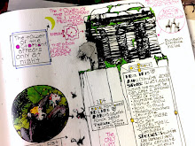
About the maps so far and the thinking behind them-
The good: It's cool as fuck art that oozes character and style. It conveys mood and feeling and makes me want to come up with a story even without seeing any text. There's very few game maps that i can think of that have pulled something like that off, and from what I gather what you've shown so far are just the preliminary drafts.
The Bad: It works great as a high level infographic (which is what I consider the Batcave graphic and the image Pikka linked to), but is somewhat confusing as an actual location map. If I hadn't read some of the explanations on what was what going where I would likely be lost as to what the stairs were doing and such without much muddling through puzzling out things. The floor level notes do help in this. This could just be my inner simpleton coming out. Hüth's suggestion of something like a traditional draftsman style map (for simpletons like me) along with the awesome one would of course be more work, but it would completely obliterate this critique. It would be the best of both worlds I would think.
Thanks for sharing your process and progress. I am always more interested in the final product after seeing this type of stuff.
Zak, Ndege comment reflects many of the thoughts I have about your map. Well, visually very interesting, parts of it still confuse me, especially parts of the layout.
One room is the kitchen, with the drawing of pots with food in them right? And one room has a piano? I think the problem is that the map is just one piece of the bigger picture. As a whole book or "kit" if you will, it would probably make more sense, to me at least.
The artist in me likes the map. The gamemaster/dungeon master not so much.
I really think most of the comments against this will be negated when it's part of a book. I mean... you do read this stuff prior to running the game, right? You you won't be scratching your head over the piano keys. You'll have read the part about the piano and think "oh, right, that's the piano room." As opposed to looking at a rectangle with a letter in in, then flipping around looking for what that letter means.
@Ndege, @zanazz @chris
yeah, what chris said. The final map will have a key to go with the letters so you won;t have to interpret whether the kitchen is the kitchen.
However, I am sympathetic if the stair system is confusing. I only included it because I find the typical stair notation ("Leads to Room 7") annoying since now you gotta look for room 7. So I drew a line to it. If it doesn't fulfill the function of showing where you're going to the DM, then it's pointless.
Your maps are beautiful and ingenious, but my critical opinion is that I don't think they're usable. Primary problem is how you're squishing 3 dimensions into just 2 here (which is, for example, not what the Batman cutaway does). Try as I might I couldn't figure out what part was the entrance on either version of your map, until I read your response the Chris earlier (suggest at least the entrance be "A" and letter other stuff from bottom up).
I agree that raw numerical keys have all the disadvantages you describe. My recommended solution (the one I use) is just a one-word description on the map, e.g. "Spiders/ Troll/ Magic Tree". For me, this elegantly solves all those problems. See also Holmes maps on recent James Mal's blog.
I actually quite like that map, assuming the room information that it's keyed to is fairly in-depth. It's clear (to me), it's much more informative than the usual method of mapping, and it's a lot more visually interesting.
That said, unless I'm reading it wrong, the second floor is larger than the ground floor by 10ft. Not a problem unless this is a building within a city, in which case people might be curious as to the 10ft section of building that sticks out. Although, since it's home to a medusa, they'll probably avoid investigating (unless they're PCs, of course).
See, I think the Batman cutaway DOES take liberties with three-dimensional space. It's not a simple cut-away - look at the images and how big Batman would be within them and you realize it can't be proportionally accurate. Also, while we're looking at the rooms from the side and also seeing the contents from that same angle, the contents are still distorted to fit.
The difference between that and Zak's map is that Zak's is a top-down view, with images that are not. That doesn't phase me - it's like laying out the board for "Clue" and then placing Polaroids in each room. The confusion I had initially was mainly over which floor was which, and that's solved now.
But maybe I've been listening to Scott McCloud too long - the idea a drawing of a detail of a room can also be the floor plan doesn't seem odd when we can accept time transpired between two panels of a comic. I don't envy you, Zak - you might be stuck between alienating people who are confused by maps like this, or depriving the rest of a neat idea.
@Delta
Totally disagree. Totally in every way. I use maps like this (in sketchy form) all the time,
The map may not be as clear as is possible, but it's very usable. Once it's keyed the entrance will have the word "entrance" written on the key. Which is the only way you figure out the entrance on any map.
The only time I use a non-normal view is in the gazebo/cupola at the top left and that's obvious, but it'll also be on the key.
@bigjt
Since it's an apartment building each floor can be a slightly different size. Neighboring units are not depicted.
Hey Zak, a legitimate and honest reply. I could list some specific usablity issues but guess I'll skip that. It's a beautiful piece of artwork, good luck with it.
@delta
if you've got some, i'd like to hear them
Post a Comment